CD, CD Çalar, DVD, DVD Çalar, SACD, LP, Plak Çeşitleri ve Fiyatları
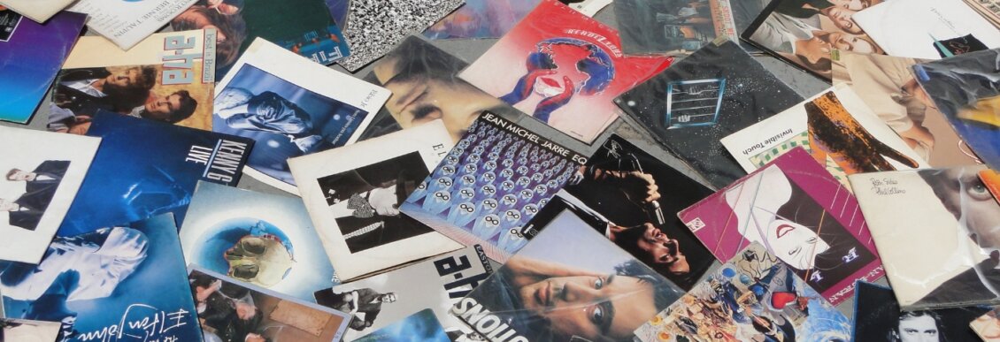
Pre-mp3, iPod and smartphone, the visual culture of recorded music were all important to delivering music. But in an age where music is less tactile, and widely consumed more passively, does artwork design still matter?
Music today is easily listenable on your personal portable digital device of choice. Gone are the days of clumsy cassette tapes, delicate CDs, or heavy vinyl.
Good bandwidth, decent hard disk space, and a user interface are all that are needed for a satisfying listening experience. It’s as intuitive as dropping a needle into a groove or slotting in a cassette or CD.
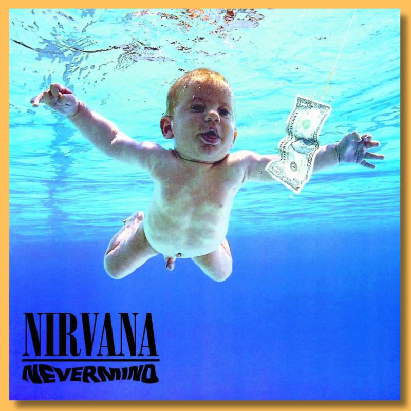
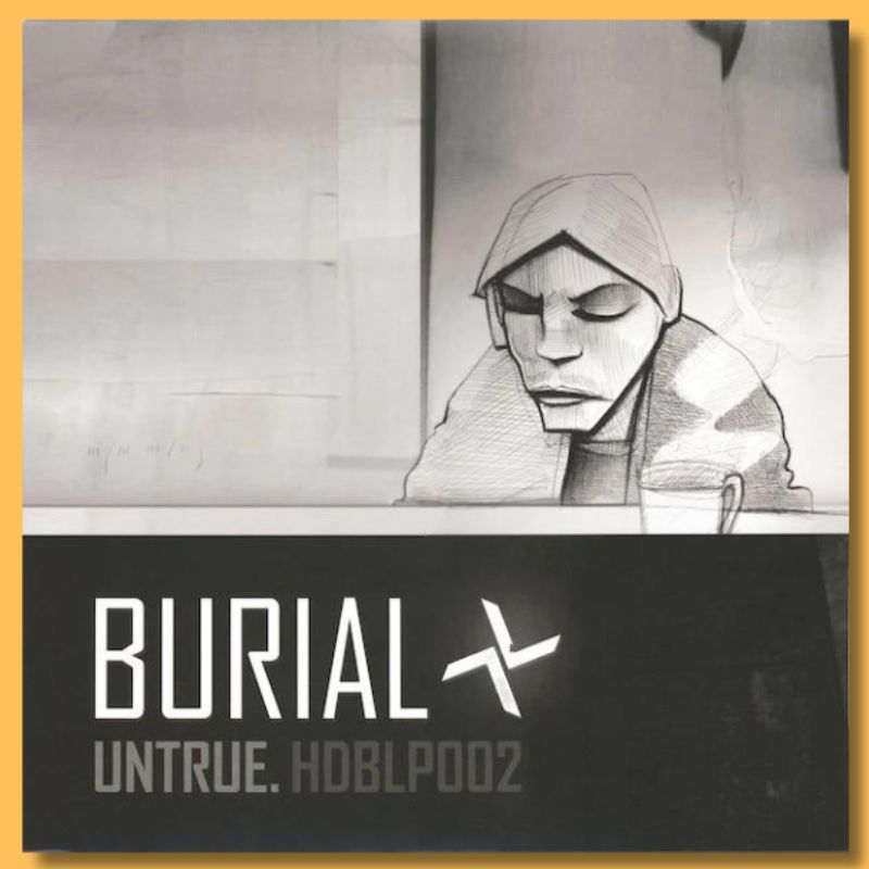
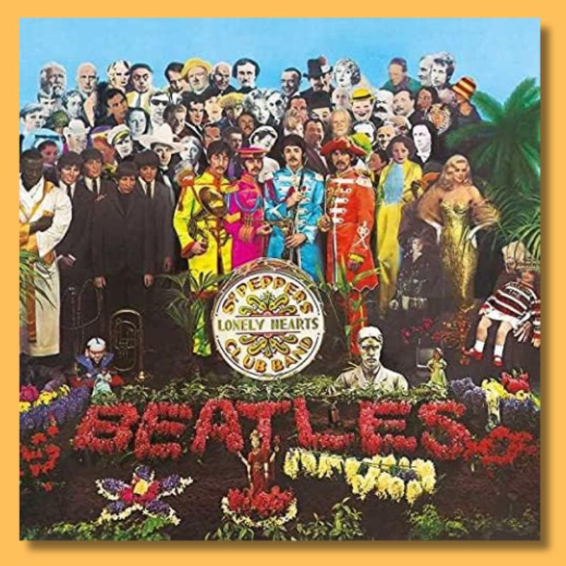
We might reasonably expect, therefore, that accompanying visual design for music would be on the decline, which would be a shame. For many fans and musicians, the artwork might be their first thought. Covers such as Nirvana’s ‘Nevermind’, The Beatle’s Sgt Peppers’s Lonely Hearts Club Band, or, closer to this publication, Burial’s ‘Untrue’ are deeply entwined in people’s music appreciation.
[advert]
Online listening platforms are indeed full of the elements previously used to grace a record sleeve; artist logos and supporting graphics; photography; lyrics; liner notes et al. And it doesn’t stop there as it crosses over into the broader online landscape via social media, website design, and digital advertising.
But ask yourself, how often do you connect with the album artwork in the same way you used it? However skeuomorphic design becomes, does it really have the same impact? Jonathan Barnbrook, the designer for David Bowie’s 2002 album Heathen, elaborates:
“It has really affected a project from the ground up as you have to be aware of all of the different formats and uses. For example, how would a billboard design translate as an icon on a phone when music is playing? What happens when it is used on a website that is streaming it exclusively? How will it work in social media – which is really important? Any design has to be adaptable enough to now work in lots of situations.“
[quote align=right text=”It has really affected a project from the ground up as you have to be aware of all of the different formats and uses.”]
Nostalgic types may bemoan the “end of vinyl” and the implicit loss of handling a physical record. Yet, the overall canvas now available for creative expression has grown exponentially. Yes, they might be smaller, but there are more options now. Which perhaps gives naysayers some relief.
Mark Farrow, Designer of the Year in the Creative Review Peer Poll in 2004, as well as behind experimental sleeves for the Hacienda and Factory Records, explains:
“Visual design is no less important than ever; it’s just got smaller in many cases. One has to assume that most people will now view your work digitally as opposed to holding something physical, and as such, they will almost certainly view at a smaller size too, usually the screen of a smartphone. This has increasingly led to our team treating a music design project as a branding exercise.“
For most labels, physical media is no longer financially viable. Yet arguably, their appeal is stronger than ever. Handling a physical record, opening the sleeve, and examining the artwork can still be integral to the recorded music experience. Farrow continues:
[advert]
“It’s interesting. I think people now either want their music for nothing, i.e. streamed, or (for fans in particular) they are willing to pay a premium to own something physical and special. This has led, increasingly, to us being able to create some really lavish and complicated pieces that only a few years ago would have been impossible because of budget restraints etc. Record companies have woken up to the value of these elevated physical releases. People are even buying cassettes again, which frankly, I could do without…“.
[quote align=right text=”Record companies have definitely woken up to the value of these kinds of elevated physical releases.”]
Indeed, recent years have seen a rise in short-run releases on cassette and vinyl. People are pushing the boundaries of what music packaging can be. And the result often borders on fine art – something to be objectively valued and possibly never even opened and played. One look at the resell prices on Discogs will suggest as much.
Barnbrook agrees: “Physical releases changed completely once digital became mainstream – people are aware of their uniqueness, so they become another way of supporting artists. This means you can play much more with limited editions and the physicality of the printing. It’s also far easier to press a vinyl nowadays. This, along with access to the tech to make a decently produced album, means its actually more accessible than ever to release an album (physically).“
There are other green shoots too. The live poster and flyer are also deemed alive and well. They are accompanied by new promotional material formats that play to the strengths of digital media. This ranges from bespoke Apps to downloadable graphic elements for listeners to use. That certainly was not something that would have been considered even 20 years ago.
Electronic music, in particular, is often regarded for its sense of community. Visual identity plays a vital role in this. Furthermore, many record labels are as influential for their design and surrounding cultures as they are for the music that they produce. In some cases, Defected, for example, it’s part of the branding and is instantly recognizable. There are others, too, such as Ghostly, Shall Not Fade, Lobster Theremin or Rhythm Section. Plus, there are many attractive labels on Bandcamp with exciting artwork.
In recent years, significant discourse within popular science has made a case for ‘storytelling’. In the broadest sense, it is to be viewed as the zenith of human culture. If we accept that, a record package must surely be one of the ultimate human expressions. Jonathan Barnbrook says, “When the visual design compliments the music, then there is an almost spiritual enhancement of the listening experience. It confirms all the meaning the artists have put into the music and somehow makes it ‘better’. This kind of thing isn‘t really understood. The question of ‘How do visuals represent music?’ is as complex and difficult a question as ‘How does music work?’“
However music is disseminated, the visual element is never simply vacuous window dressing. It continues serving as a medium for the music artist and the designer. Digital may have changed how we consume music, but the importance of accompanying visual art and design remains as vital as ever. Long live album artwork!
[social-links heading=”Follow Attack Magazine” facebook=”https://www.facebook.com/attackmag” twitter=”https://twitter.com/attackmag1″ instagram=”https://www.instagram.com/attackmag/” youtube=”https://www.youtube.com/user/attackmag” soundcloud=”https://soundcloud.com/attackmag” tiktok=”https://www.tiktok.com/@attackmagazine”]
[product-collection]
attackmagazine

Pre-mp3, iPod and smartphone, the visual culture of recorded music were all important to delivering music. But in an age where music is less tactile, and widely consumed more passively, does artwork design still matter?
Music today is easily listenable on your personal portable digital device of choice. Gone are the days of clumsy cassette tapes, delicate CDs, or heavy vinyl.
Good bandwidth, decent hard disk space, and a user interface are all that are needed for a satisfying listening experience. It’s as intuitive as dropping a needle into a groove or slotting in a cassette or CD.
We might reasonably expect, therefore, that accompanying visual design for music would be on the decline, which would be a shame. For many fans and musicians, the artwork might be their first thought. Covers such as Nirvana’s ‘Nevermind’, The Beatle’s Sgt Peppers’s Lonely Hearts Club Band, or, closer to this publication, Burial’s ‘Untrue’ are deeply entwined in people’s music appreciation.
[advert]
Online listening platforms are indeed full of the elements previously used to grace a record sleeve; artist logos and supporting graphics; photography; lyrics; liner notes et al. And it doesn’t stop there as it crosses over into the broader online landscape via social media, website design, and digital advertising.
But ask yourself, how often do you connect with the album artwork in the same way you used it? However skeuomorphic design becomes, does it really have the same impact? Jonathan Barnbrook, the designer for David Bowie’s 2002 album Heathen, elaborates:
“It has really affected a project from the ground up as you have to be aware of all of the different formats and uses. For example, how would a billboard design translate as an icon on a phone when music is playing? What happens when it is used on a website that is streaming it exclusively? How will it work in social media – which is really important? Any design has to be adaptable enough to now work in lots of situations.“
[quote align=right text=”It has really affected a project from the ground up as you have to be aware of all of the different formats and uses.”]
Nostalgic types may bemoan the “end of vinyl” and the implicit loss of handling a physical record. Yet, the overall canvas now available for creative expression has grown exponentially. Yes, they might be smaller, but there are more options now. Which perhaps gives naysayers some relief.

Mark Farrow, Designer of the Year in the Creative Review Peer Poll in 2004, as well as behind experimental sleeves for the Hacienda and Factory Records, explains:
“Visual design is no less important than ever; it’s just got smaller in many cases. One has to assume that most people will now view your work digitally as opposed to holding something physical, and as such, they will almost certainly view at a smaller size too, usually the screen of a smartphone. This has increasingly led to our team treating a music design project as a branding exercise.“
For most labels, physical media is no longer financially viable. Yet arguably, their appeal is stronger than ever. Handling a physical record, opening the sleeve, and examining the artwork can still be integral to the recorded music experience. Farrow continues:
[advert]
“It’s interesting. I think people now either want their music for nothing, i.e. streamed, or (for fans in particular) they are willing to pay a premium to own something physical and special. This has led, increasingly, to us being able to create some really lavish and complicated pieces that only a few years ago would have been impossible because of budget restraints etc. Record companies have woken up to the value of these elevated physical releases. People are even buying cassettes again, which frankly, I could do without…“.

[quote align=right text=”Record companies have definitely woken up to the value of these kinds of elevated physical releases.”]
Indeed, recent years have seen a rise in short-run releases on cassette and vinyl. People are pushing the boundaries of what music packaging can be. And the result often borders on fine art – something to be objectively valued and possibly never even opened and played. One look at the resell prices on Discogs will suggest as much.
Barnbrook agrees: “Physical releases changed completely once digital became mainstream – people are aware of their uniqueness, so they become another way of supporting artists. This means you can play much more with limited editions and the physicality of the printing. It’s also far easier to press a vinyl nowadays. This, along with access to the tech to make a decently produced album, means its actually more accessible than ever to release an album (physically).“

There are other green shoots too. The live poster and flyer are also deemed alive and well. They are accompanied by new promotional material formats that play to the strengths of digital media. This ranges from bespoke Apps to downloadable graphic elements for listeners to use. That certainly was not something that would have been considered even 20 years ago.
Electronic music, in particular, is often regarded for its sense of community. Visual identity plays a vital role in this. Furthermore, many record labels are as influential for their design and surrounding cultures as they are for the music that they produce. In some cases, Defected, for example, it’s part of the branding and is instantly recognizable. There are others, too, such as Ghostly, Shall Not Fade, Lobster Theremin or Rhythm Section. Plus, there are many attractive labels on Bandcamp with exciting artwork.
In recent years, significant discourse within popular science has made a case for ‘storytelling’. In the broadest sense, it is to be viewed as the zenith of human culture. If we accept that, a record package must surely be one of the ultimate human expressions. Jonathan Barnbrook says, “When the visual design compliments the music, then there is an almost spiritual enhancement of the listening experience. It confirms all the meaning the artists have put into the music and somehow makes it ‘better’. This kind of thing isn‘t really understood. The question of ‘How do visuals represent music?’ is as complex and difficult a question as ‘How does music work?’“
However music is disseminated, the visual element is never simply vacuous window dressing. It continues serving as a medium for the music artist and the designer. Digital may have changed how we consume music, but the importance of accompanying visual art and design remains as vital as ever. Long live album artwork!
[social-links heading=”Follow Attack Magazine” facebook=”https://www.facebook.com/attackmag” twitter=”https://twitter.com/attackmag1″ instagram=”https://www.instagram.com/attackmag/” youtube=”https://www.youtube.com/user/attackmag” soundcloud=”https://soundcloud.com/attackmag” tiktok=”https://www.tiktok.com/@attackmagazine”]
[product-collection]